
Digital Marketing First Impressions: Why Most Sites Lose Visitors in Five Seconds
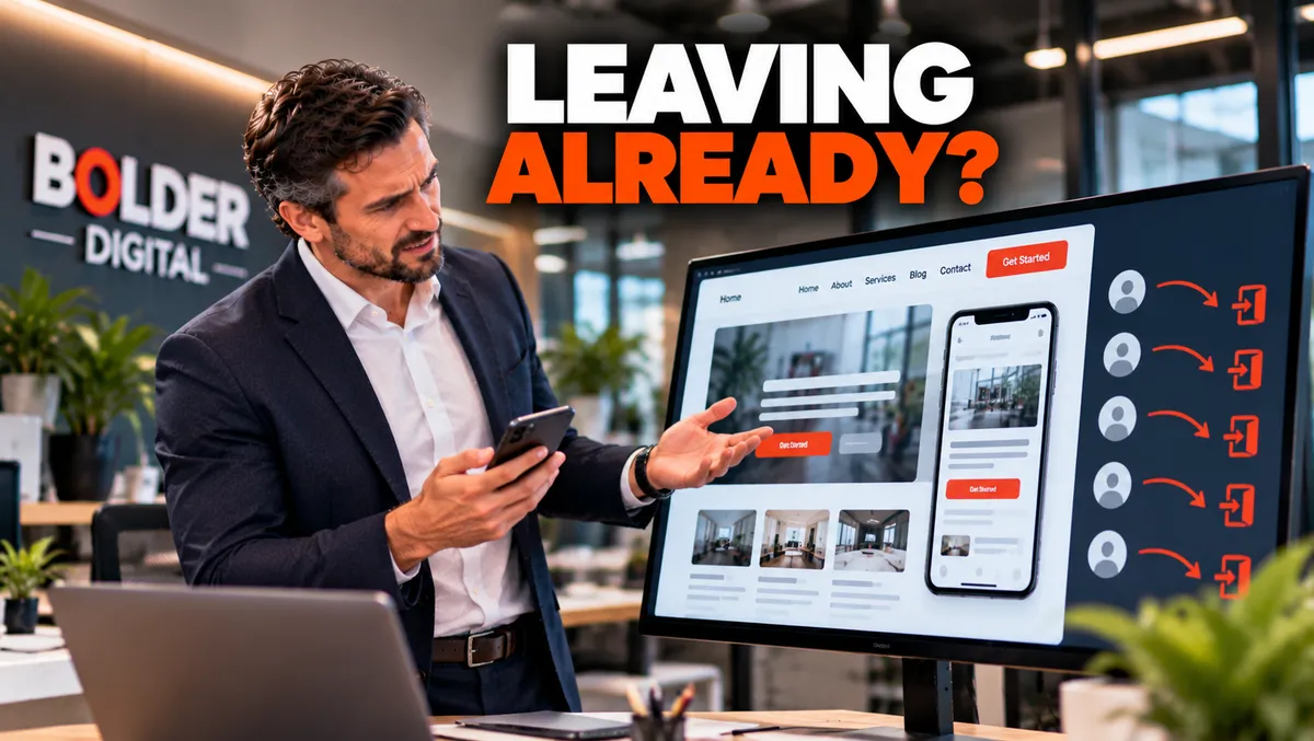
You can spend months getting people to your website. You can pay for the ads, climb the search results, and collect the reviews. Then a visitor lands on your page, takes a quick look, and leaves. They did not read your best content. They did not see your prices or your testimonials. They made a snap decision, and it went against you. At Bolder Digital, we see this more than any other leak in a digital marketing budget, and it is often the cheapest one to fix.
What Gets Decided in Those Seconds
“Five seconds” is shorthand, and some research suggests the first judgement forms even faster. Either way, a visitor is quietly asking four questions:
Does this load, or should I go back?
Does this look like a real, credible business?
Am I in the right place?
What do I do next?
If your site fails any of them, the rest of your marketing never gets its chance.
Speed: The Silent Deal Breaker
The first question is answered before a single word is read. Google research from around 2016, still the standard reference, found that the chance of a visitor leaving increased by about a third as a mobile page took three seconds to load instead of one, and by about 90 percent at five seconds. The same body of research reported that more than half of mobile visits were abandoned when a page took longer than three seconds. These figures are old, and today’s phones and networks are faster, but visitors’ patience has not grown.
Google’s Core Web Vitals give a practical target. Aim for the main content to appear in about two and a half seconds or less. Common causes of slow sites include:
huge uncompressed images
heavy sliders and background videos
too many plugins and third party scripts
cheap or overloaded hosting
no caching
Test on a phone, on mobile data, away from your office wifi. Regional coverage in Tasmania can be patchy, and your customers will not always have a strong signal.
Looks: Credibility Is Judged Visually
The Stanford Web Credibility Project, a large study from 2002, found that people most often justified their judgement of a site’s credibility by its visual design, ahead of its content. It is an old study, but experience backs it up. People decide quickly whether a site looks trustworthy, and they use appearance as evidence.
The basics matter more than fashion:
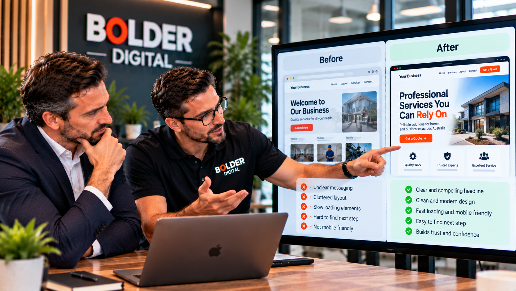
a clean, uncluttered layout
readable type, at a decent size, with good contrast
consistent colours and branding
real photos of your team, premises, and work, not generic stock images
no broken images or links
a padlock in the browser, showing the site is secure
up to date details, such as the current year and your correct hours
spelling that has been checked
None of this needs a big budget. It needs care.
Clarity: Am I in the Right Place?
This is where most small business sites fail. A first time visitor should be able to tell, without scrolling, what you do, who it is for, and where. Compare these headlines:
“Welcome to our website”
“Reimagining the future of home services”
“Plumbing and gas fitting in Launceston and the Tamar Valley”
“Family dental care in Launceston. New patients welcome.”
Only the last two tell a stranger anything. Under the headline, add one supporting line that says what makes you worth choosing, and show a real photo that supports it.
The Next Step: What Do I Do Now?
Visitors who understand what you do still need to know what to do about it. Make one primary action obvious, such as call now, book online, or request a quote. On a phone, that usually means a tap to call button and your hours, visible without hunting. Keep secondary options quieter, and cut anything that competes with the main one.
A long menu with a dozen items, three different buttons, and a rotating banner is a recipe for doing nothing.
Trust Signals Close to the Top
Reassurance helps right from the start. Place a few trust signals near the top of the page:
your Google rating with the number of reviews, linked to the real profile
licences, accreditations, and memberships
a line such as “serving the Launceston area since 2012”, if it is true
a recognisable local connection, such as a club you support
We cover this in more detail in our piece on social proof.
Mobile First, Really
Most visitors reach many small business sites on a phone. A page that looks good on a desktop can fall apart on a small screen, with headlines that wrap oddly, buttons that are too small to tap, and the call to action pushed below the fold. Test the mobile version separately, with your own thumb.
Watch out for pop ups that cover the page. Google has long discouraged intrusive pop ups on mobile, and they irritate visitors anyway. A chatbot greeting is fine if it is timed and easy to dismiss, as we describe in our piece on the first message.
What Kills a First Impression
slow loading
autoplaying video or music
big rotating sliders
cookie banners or pop ups that cover the content
generic stock photos
walls of text and tiny grey type
a look that is a decade old
broken links and “coming soon” pages
a phone number buried in the footer
crowded menus
Match the Message to the Click
The page a visitor lands on has to match what brought them there. If an ad says “emergency plumber” and the page opens with a story about the company’s history, many will leave. Send each campaign and search listing to a page that continues the same conversation. It is one reason more traffic is not always the right goal, as we explain in our piece on traffic.
How to Test Your Own Site
You do not need expensive tools.
The five second test. Show your homepage to a few people unfamiliar with your business for five seconds, then close it. Ask what the business does, who it is for, and what they would do next. If the answers are wrong or vague, you have your list.
The phone test. Open the site on your phone using mobile data, away from wifi. Is it quick? Can you read it and tap the buttons?
A speed check. Google’s PageSpeed Insights tool is free and shows how your pages perform.
Your analytics. Look at how many visitors leave without doing anything on each landing page, and compare traffic sources. A page where one source performs far worse than the rest points to a message mismatch.
Fix It in the Right Order
A convincing first impression rarely needs a full rebuild. A sensible order is:
speed and mobile basics
a clear headline and one main action
trust signals near the top
clearing out clutter
matching key landing pages to their traffic
How Bolder Digital Approaches This
At Bolder Digital, we review your site the way a stranger would. We run the five second test, check speed and mobile, look at where visitors leave, and fix the biggest problems first, before any money goes into more traffic. You can see how this fits into our Google Business Profile optimisation and AI Chatbot services, which both depend on a site that makes a good first impression.
The Bottom Line
Visitors decide quickly, and they decide on speed, looks, clarity, and an obvious next step. Make the page load fast, look trustworthy, say plainly what you do and where, and offer one clear action, on a phone first. Fix that before spending more on traffic, and every other part of your marketing works harder.

Frequently Asked Questions
How fast should my website load?
Faster is better. Google’s research found bounce chances rise sharply as mobile load times climb past a few seconds, and its Core Web Vitals target the main content appearing in about two and a half seconds or less. Test on a phone using mobile data.
What is the five second test?
Show your homepage to someone unfamiliar with your business for five seconds, then ask what the business does, who it is for, and what to do next. If they cannot say, your first impression needs work.
What should be above the fold on my homepage?
A clear headline saying what you do and where, one supporting line, a real image, one main action, and a few trust signals. Remove anything that does not support that.
Does design really affect trust?
Yes. A well known Stanford study found people most often judged credibility by visual design, and experience since agrees. Clean layout, readable text, real photos, and a secure padlock all help.
Do I need a new website to fix this?
Often not. Speed fixes, a clearer headline, a single main action, trust signals near the top, and removing clutter can transform a first impression without a rebuild.
Jarryd Holmes, Founder & Owner, Bolder Digital | Prospect Vale, Tasmania | bolderdigital.com.au